Creating Useful Style Guides for Web Projects - Part 1
This post was originally posted on SmallTalk's website.
Today's post is a two-parter. In this post, we are exploring the use of style guides and how they can help in all aspects and phases of a digital project by minimizing ambiguity and setting definable parameters that can be validated and tested against. A good style guide will help reduce hours spent by all parties throughout the phases of the project. In a future post, we'll take a look at some examples of style guides, what works about them, and explore some tools that can help the creation of these guides.
What is a styleguide?
A styleguide sets rules around how things look and behave. Styleguides are the projects visual source of truth for both user interface (UI) and user experience (UX). More focussed than brand guidelines, a styleguide is intended to be the visual and functional requirements definition for websites or applications.
A styleguide will pull in components from its parent design system which may include overall brand guidelines, design system or an established pattern library. If a brand has very specific and strong brand guidelines, design system or an existing pattern library, a project's styleguide will be derived heavily from it or may not need to be developed at all. However, if these parent documents do not define every component in the project, a styleguide should be created to cover these cases.
Style guides exist in different formats - anything from a static PDF or image, to a single web page or an entire microsite or cloud-based prototype can be used for host the styleguide. Of course, they're more useful as univerally accessible documents that are easily updated, so web-based styleguides are popular for a reason. Thus, the best styleguides are built as a collaboration between the design team and the development team. Not only will they define how things look, they'll also define how to build those things with the correct code. This example from Lonely Planet exemplifies this full-fledged approach, covering both the visual aspect of components and layout but also specifying a code pattern for how to build the components.
The main point is that it is a visual tool that can be referenced by multiple people playing their respective roles. There may be a written component to it, but it is primary visual. A styleguide can be developed in conjunction with the main layouts, or as a template before the main layouts are defined. Ideally, the guide is a deliverable that the client approves with the designs.
Why use a style guide?
While front-end technlogy seems to change on a monthly or weekly basis, the phases that a project goes through often do not. Whether your business practices waterfall, agile, hybrid, or some other methodology to get the job done, at some point, there is a handoff between creative and tech. A layout has to get out of a designers head, into a document, approved, and handed off to the developers for implementation. This could happen once, or it could happen many times over the course of a single project, but the transition point and hand-off process is always there. This handoff process is a crucial step and it is important to minimize abiguity so that specifications can be met.
Developers love specification and requirements (maybe not actually _writing_ them, but that's another topic). By putting rules and definitions behind everything from how the user is supposed to interact with something on screen to the way the layout changes at a particular breakpoint, a specification can be met - and tested against. These requirements become the acceptance criteria that define whether the task was completed or not.
Without these set of rules, ambiguity creeps into the picture. Ambiguity is a developers — and ultimately, a user's — worst nightmare. Ambiguity allows room for error, leaves things open to interpretation and subjectivity, and ultimately, cannot be tested against. Much nature abhors a vacuum, developers abhor ambigutity.
Design, however, can be more comfortable in the realm of the ambiguous. Sometimes this is intentional. Art, by definition, is open to interpretation and can be intentionally unintentional (if that makes sense). More often than not, though, it's a result of shifting business requirements (see Peter's post) or a pressing time or budget constraint that does not allow the team to fully flesh out how some new component will function or look.
Since one of the styleguide's purpose is to fulfill the role of a requirements document for UX and UI, it forces designers to design to the requirements. This is particularly useful after a project has been deployed and there are enhancements or iterative changes to be made, particularly by another designer.
When to create a styleguide
While we don't always have the luxury of endless budget and time, I would argue (and so would Brad Frost) that spending design hours to create a styleguide before high-fidelity design even begins will pay off on the back-end of the project.
By starting with the styleguide, designers are taking into account the UX decisions done in wireframing phase, along with any brand standards to apply. The styleguide will lay down the groundwork for the high-fidelity design. The completed styleguide should be handed off to the client for approval, which can then be given to production designers *and* to front-end developers.
In a web project, while the designers are beginning their high-fidelity mockups, the developers are using the completed and approved styleguide to write base CSS that will drive the majority of the site's look and feel. Since the client has already approved the style guide, there should be no danger in having to "re-do" anything in rounds of revision.
What's in a good styleguide?
In creating a styleguide, the bare minimum should be included, for all required breakpoints:
Layout
- Responsive breakpoints
- Grid system
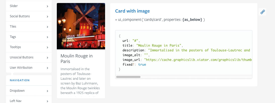
Design Components
- Icons
- Image Galleries
- Thumbnails
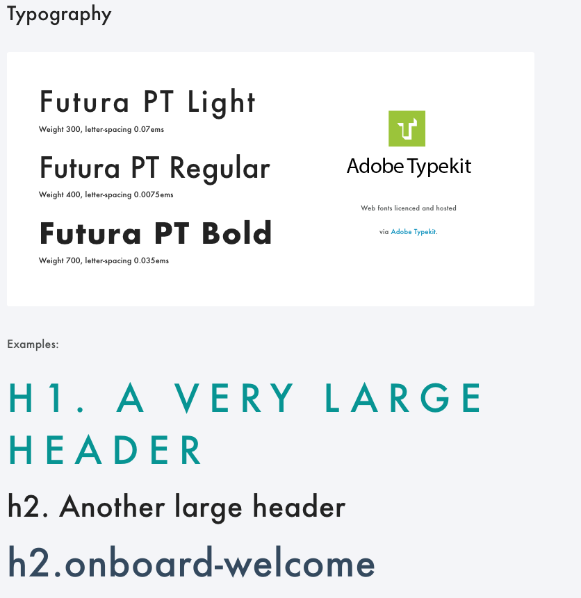
Typography
- Font Faces
- Heading Styles and Type Sizes
- Paragraph / Body Styles and Type Sizes
- List Styles (ordered; unordered) and Type Sizes
- Any other specialized definitions, like form label styles or subheading styles
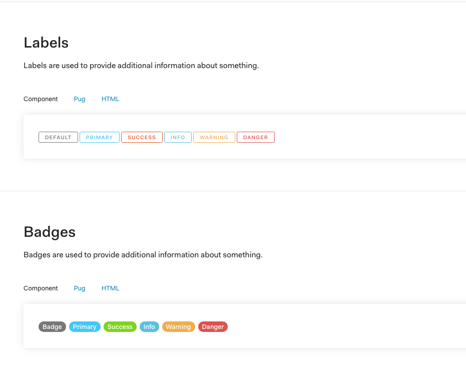
Interactive and Navigational Elements
- Buttons - rest, hover states
- Links - rest, hover states
- Main Nav - rest, hover, active states
- Breadcrumb Nav
- Togglers - on, off states
- Tool Tips - on, off states
- Alert boxes
- Modal / overlay boxes
- Custom form elements (checkboxes, radio buttons, selects, etc)
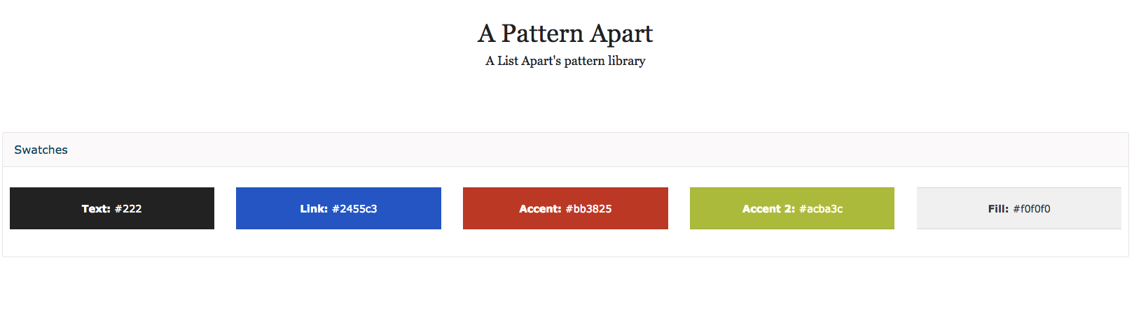
Color Palette
- Primary colors and when to use them
- Secondary, tertiary colors and when to use them
Animation
- Loading icons
- Progress bars
- Any other animations the layout may require
Resources and Citations
- Design System vs Pattern Libraries vs Style Guides: What's the difference?
- Nielsen Norman Group - Front-End Style-Guides: Definition, Requirements, Component Checklist
- Atomic Design by Brad Frost
- Styleguides.io - Collection of Styleguide Examples
- Sajio George Brand Styleguide Examples
Stay Tuned for Part two of this post, where I will evaluate some helpful tools to streamline the process of creating a styleguide, as well as take a closer look at more examples and why they work!